This month’s OWH Design Bootcamp was all about using white space to frame the focal point on our cards. Now, I don’t always use a lot of white space on my card, but when I find a simplier CAS card, I do enjoy the final look.

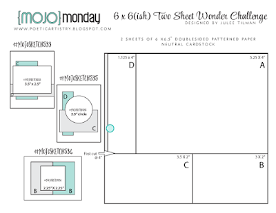
sketch – https://kristiemarcotte.com//2013/06/case-this-sketch-33.html
embossing folder – Quickutz
star die cuts – Lil Inker Designs
stamp – Stampendous
Versafine ink
Thanks for visiting my blog today!


I just LOVE your work, Kristie! This is such a fantastic CAS card and makes a big statement! TFS!
Tricia
Great job Kristie! That star embossing folder add such nice interest to your 'white space' in this design and the navy, kraft and white combo is really crisp. Thanks for joining in on this month's bootcamp.
I really like your card and the embossing on the kraft paper is the right strike to pull the recipient in to the message. I'm glad it was picked for the end of year boot camp review.
Kristie, I am so glad Paula included one of your cards in her bootcamp recap. I love this card — it is CAS perfected! Going have to look for that ef. 🙂