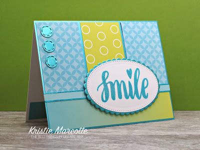
This week’s OWH Midweek Throwdown card challenge is to make a card that has to do with time. And I’m guessing lots of others participating in the challenge will be using the same Hero Arts stamp set that I did. Especially since it’s one of the OWH fundraiser sets.

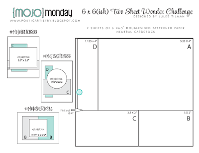
sketch – https://kristiemarcotte.com//2012/09/mojo-monday-257-contest.html
paper – My Mind’s Eye – Lost & Found Two Sunshine
stamps – Hero Arts
border punch – Fiskars
die cuts – Spellbinders
ribbon – from stash
Pearl Pen – Viva Decor
Versafine ink
card base – Int. Paper Accent Opaque Digital 100#
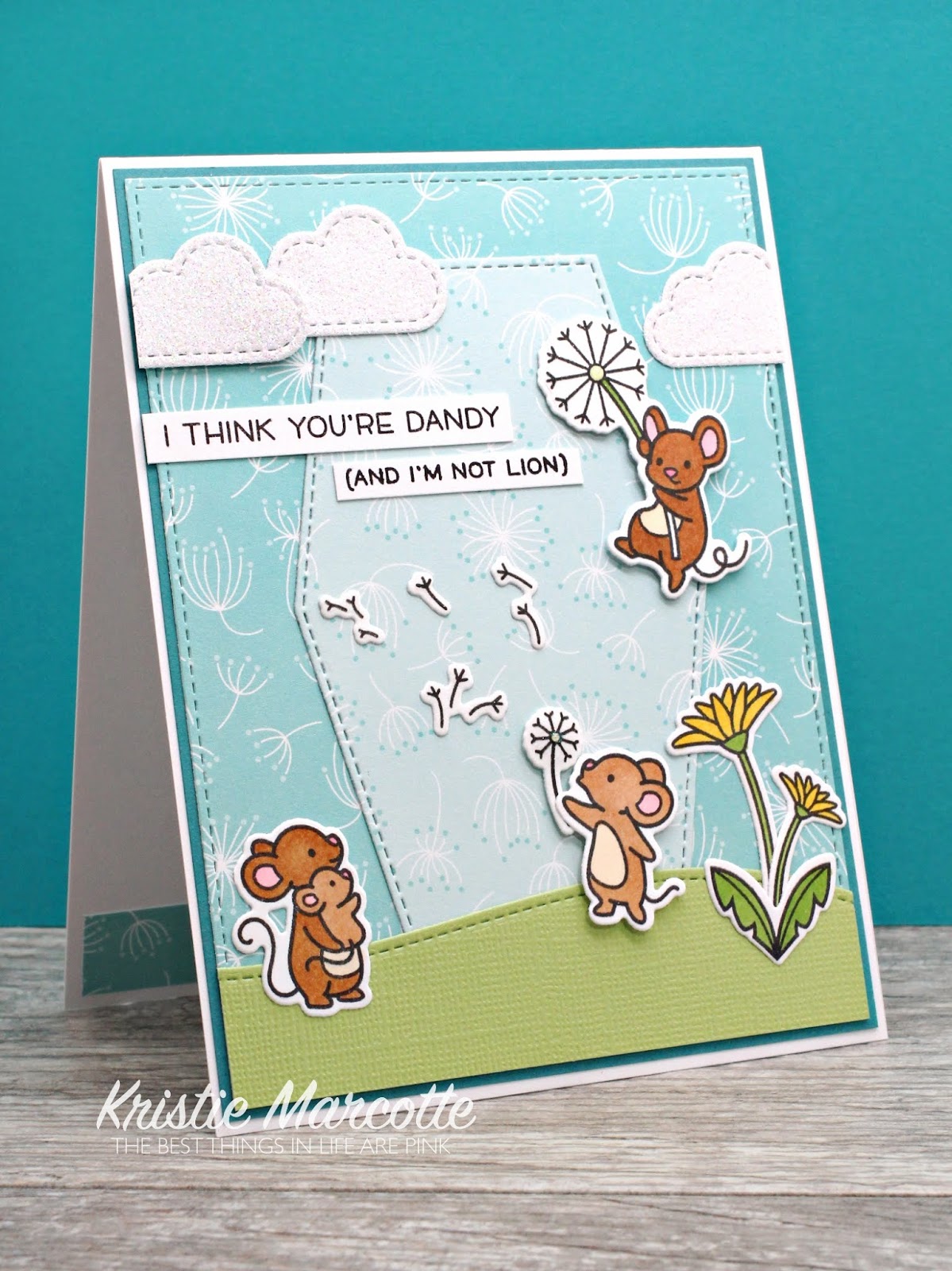
This week’s Flutter by Wednesday challenge is a sketch challenge. I did change it from the square size to an A2 card size, but still kept the basic layout of the sketch. And, as always, the other requirement is to add either a fairy or butterfly. My current 6×6 is now down to scraps and wouldn’t work for this sketch, so I decided to go with patriotic colors. And I’m still making Miss You cards for Operation Write Home.


sketch – https://kristiemarcotte.com//2013/04/flutter-by-wednesday-237.html
paper – Authentique – Pride
stamp – Paper Smooches
twine – The Twinery
butterfly punch – Martha Stewart
die cuts – Spellbinders
Versafine ink
card base – Int. Paper Accent Opaque Digital 100#
Thanks for stopping by my blog today!


What a great pair of cards, and my hand is raised….I used the same Hero Arts stamp set for my card 🙂 GMTA! I love the way you tilted the image and added the sentiment banner just underneath. Awesome colors too! Those butterfly accents really dressed up the Miss You card nicely! NJ on both!
Fabulous cards, both have great impact, nice use of variety of scaled papers with strong contrast, all make them fabulous! TFS!
Love how you used the different patterned papers together – on both cards!
Fabulous cards!! I really like that first one!! Thanks for playing along with my Flutter By Wednesday Challenge!
I like how you tilted things on your first card. I rarely do that because I always think it looks off, but yours looks great. All those papers look prefect togeterh and the dot in the center of the clock makes it pop.
Both cards are fantastic. I, too, love the patterns that you combined in each card. I especially like the angled placement of the clock face on the first one. Nice job on both!
Love the use of this paper pad. Your elements are arranged so beautifully! A pleasing card to the eye.